Killed a two-stage “jank” hover, then rebuilt it into one smooth, intentional reveal.
I redesigned the Services interaction on a Dallas-Fort Worth private-chef marketing site, replacing a glitchy shrink-and-shift hover with a single anchored reveal, then made the FAQ, booking form and SEO/GEO layer production-ready.
View the live site →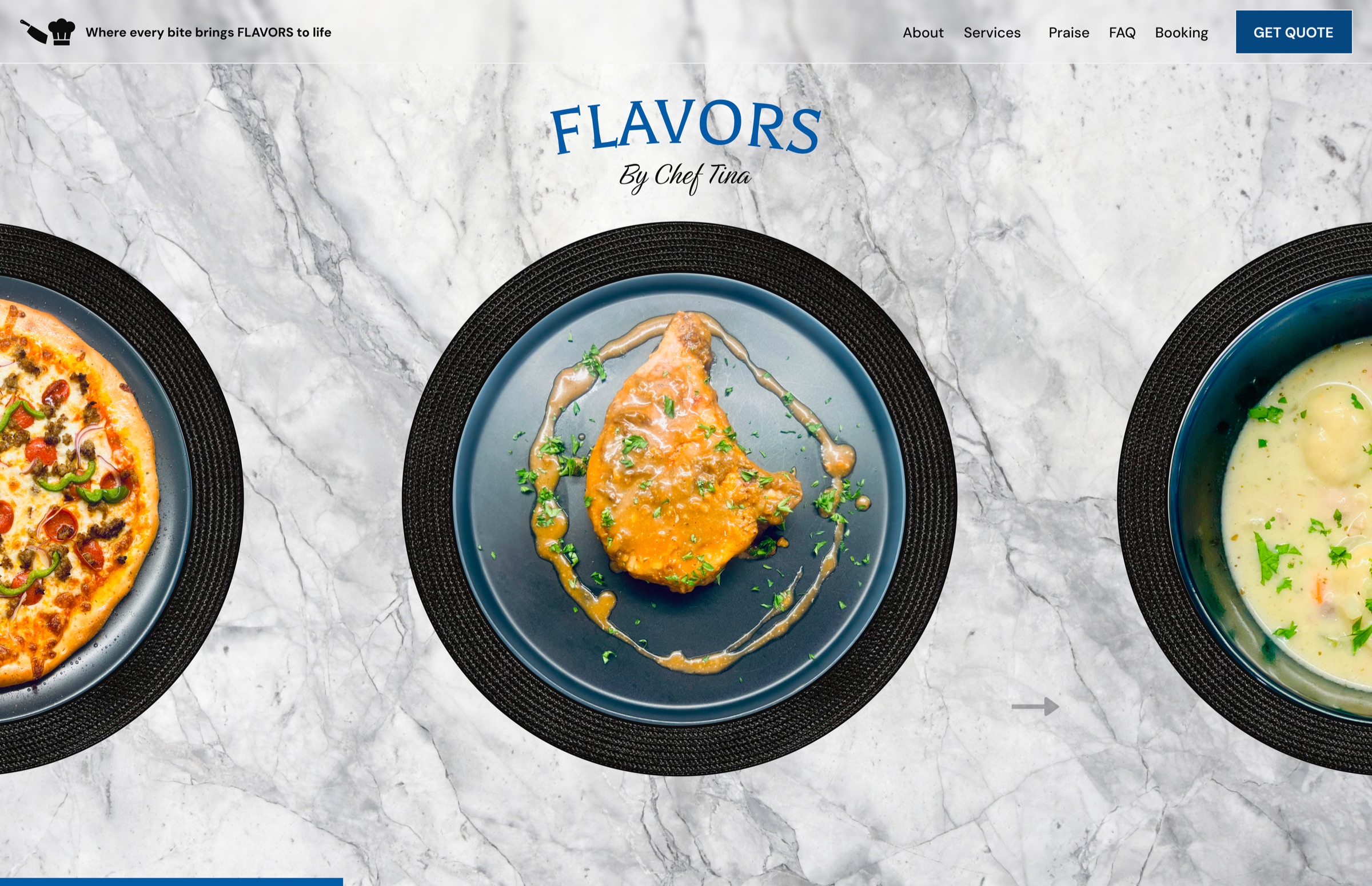
A marketing site that had to feel finished in the first ten seconds.
FLAVORS by Chef Tina is a marketing site for a Dallas-Fort Worth private chef and catering business, designed in Figma and built solo with AI assistance. The audience is prospective clients booking dinners, catering and meal prep, so every section has to read as polished and trustworthy on first scroll.
Constraints were real: Figma was the source of truth, every section is a full-viewport snap panel, WCAG 2.2 AA was non-negotiable, and the whole thing ships on Vercel with Next.js 15, Tailwind v4 and Framer Motion. The Services section looked right in static frames but felt broken in motion.
Three decisions shaped the build.
Cut the shrink.
Hovering a service title fired two separate movements: the other titles shrank, and the active title shifted down as its caption pushed in. I diagnosed it as two animations competing, a font-size shrink on siblings plus a layout reflow on the active row, and cut the shrink entirely, against the original Figma hover spec. On a marketing page, motion clarity beats motion quantity.
Pin titles to fixed-height rows.
I pinned each title to the top of a fixed-height row so revealing a caption never reflows its neighbors. That also let me tighten the vertical rhythm to about 30% of the original padding, pulling the hover zone into the middle of the section where the eye already is.
Fire hover only within the title’s own bounds.
The cursor used to trigger a hover from as far away as the SERVICES heading, so the interaction felt unanchored and twitchy. I rewrote the detection to fire only when the cursor is within a title’s own vertical bounds. One smooth, predictable reveal signals craft; two stutters signal “unfinished.”
One hover, one motion.
I built the Services section’s desktop hover state so the title colors to brand blue, a 22px caption fades in flush-left beneath it, and the matching photo slides to its right-aligned resting place. The whole thing reads as a single motion. In the same pass, I made the FAQ fit one viewport with a scroll safety net, gave the booking date field a real MM/DD/YYYY placeholder that swaps to a picker on pointer-down, trimmed a duplicate set of footer socials, and shipped structured data (FoodEstablishment and a FAQPage block mirroring the on-page answers) for search and generative engines.
One hover, one motion. The title colors, the caption reveals, and the photo settles: no shrink, no shift, no reflow.
Sections that feel finished, not prototyped.
Behavioral
The Services hover reads as one deliberate motion, and the trigger zone matches where users actually point, removing the accidental activations from the heading area.
Qualitative
The page clears the “first ten seconds” bar. Sections feel finished, not prototyped.
Technical
FAQ content is never clipped across viewport heights, the booking date field is usable and labeled on mobile, and structured data matches visible content for valid FAQ rich-result eligibility.
“Looks right in a static frame and feels right in motion are two different acceptance tests, and the second one is the one that ships.”
The sharpest lesson was a debugging one: the preview environment reported hover: none, so the desktop interaction could not be exercised in-tool. I leaned on deterministic CSS and bounds logic plus live hard-refresh checks, instead of trusting a screenshot.
View the live site →